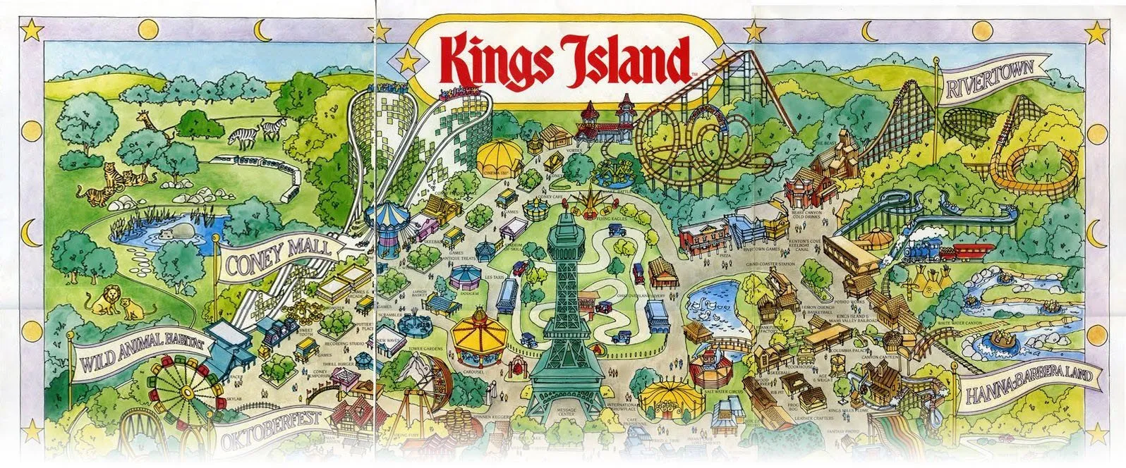
I have a thing for maps. When I was a child, my family went most summers to Kings Island, a theme park outside of Cincinnati, Ohio. With all of the rides and sights, it was a very fun place to be and spend the day together. Almost as exciting as the park itself, though, was getting my hands on that map after we got our tickets.
The map was actually not very helpful for an adult leading the pack. The level of detail, and the perspective of the drawing, made it unclear about the best way to get from place to place.
But for a kid, it was an excellent map, because it resembled the experience that the park itself offered. The illustration inspired imagining, wayfinding, discovery; it generated excitement and curiosity. It allowed my siblings and me to project ourselves into a place we had not yet reached.
Here’s a different view of the same park map, on the back side. It’s not as interesting, but it is clear about the actual dimensions of the park. My parents likely relied on this view more often while figuring out where our crew could get to in a given day.
Whereas the front of the map was about communicating experience, the back was better for understanding one’s place within the system; both important and different emphases, depending on the context of the user’s needs.
Map Fidelity is Based on the Context of Needs
Maps provide us abstractions of the world, giving us a means to understand it in ways that would otherwise be difficult. In order for them to effectively do this, we have to select the appropriate level of fidelity, based on the needs & conditions at hand, so that we can focus on the right things.
Let’s look at another example, this time in the “real world”:
The London Underground map is probably the most well known of its kind. It is quintessentially an effort to make a complex system understandable, traversable. However, this design effort has limitations; neither the tube directions nor the distances between stations are consistent with reality…
…as made evident here by the same map, with walking times added to help make the decision about riding or not. When you consider that, once underground, you don’t need to really know the path the train takes, this version of the system map is an excellent compromise between geographic accuracy and coherence.
Here is a geographically-accurate map of the same system; it’s a very complex map. It provides an entirely different view. It’s not better, but emphasizes different things. If you have a need to know discrete distances, find a place in the tube to do maintenance, or where to intercept a line via car, you would probably choose this version.
Maps Provide Us Many Things
You could probably come up with many different things maps allow us to do, or do more easily. Here are some of them:
- Simplification: abstracts and distills complexity down to what is necessary; emphasizes what is most important
- Reflection: mirrors our mental model, allows us to better access it
- Orientation: tells us our place in a complex system
- Distribution: gives us a shared perspective for common cognition and understanding
- Projection: creates a representation of what we want to do; tells us what we can do with ourselves
- Prioritization: enables comparing different options; making more informed decisions
- Opportunities: illuminates multiple possible directions and destinations
- Empathizing: helps us to consider and think about someone else’s experience
- Coherence: demonstrates the interconnectedness of things; reveals dependencies
- Agreement: aligns our internal, subjective experience in an objective, external environment; affords intersubjectivity
In the end, maps tell us something useful we can agree about and take action upon.
Design Thinking Made Tangible
As a product and service designer, I create all kinds of maps, diagrams and blueprints to help put the emerging complexity of those product & services in front of us — myself, the delivery team, the client, sometimes even the customer — so we can look at it together critically and understand what the things we are building have to offer. In doing so, we have a clear point of view, a shared context, and make better decisions.
These maps allow the implicit & individual knowledge of the team to be made explicit & shared. They create a space for us to focus on understanding when and why the customer has needs, and see where we have the best opportunities to add value to the product.
There are value proposition & business model canvases, customer journey & experience maps… these and other map-like design tools uncover and align needs and offerings, connect people and products. How do these tools relate to and interface with one another? And most importantly, how do they help us build knowledge of our customers into our products as they develop and mature?
I decided to create a “map of maps” — a metamap — and look along the product lifecycle to know when to select from the many maps & diagrams we can choose from; see how to apply them to a given product stage to achieve fit, gain traction and pursue growth; and continually keep the customer in view so that we can design our product offerings in a human-centered way.
We’ll get to that in Part 3 of this series. But before that, let’s talk more about the product we are are creating maps for in the first place. What kind of needs does the product have, and how do those needs change over time, depending the stage of its life cycle? Part 2 looks at the product as viable entity (or not), and what we can anticipate as it develops and the context around it becomes more complex.
Thanks to Emily Denny, Bridgett Colling, Tyler Etters, and Jordan Welch.


