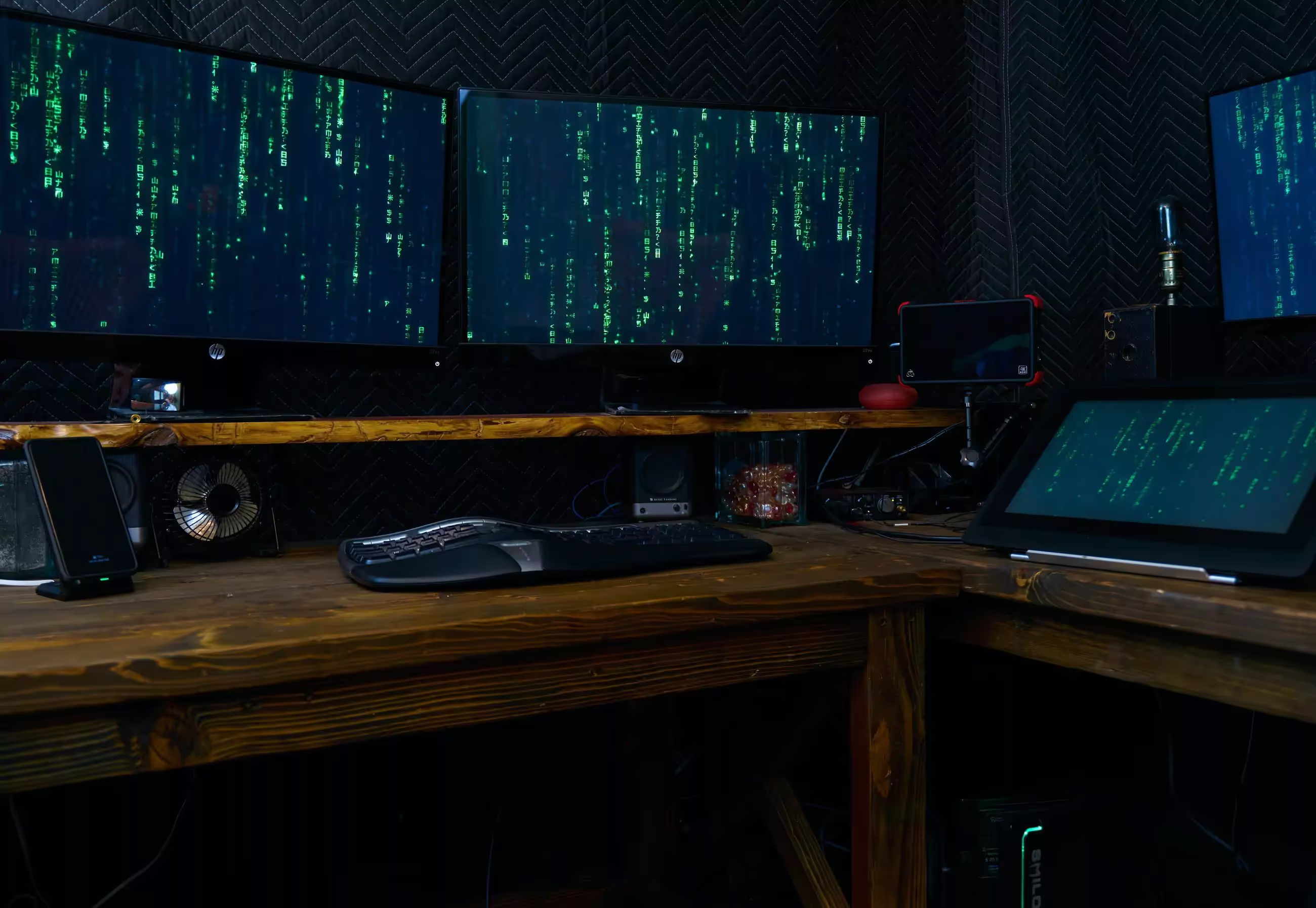
Recently I switched to a sit-stand desk, trying to be one of the cool kids and jump on board with the office fad. While I do enjoy being able to stand up for part of the day, I suddenly was close enough to my monitors that the full horizontal width required too much head turning to be effective. I took this as an opportunity to try out something I’d been thinking about for a while, flip one of my monitors vertically.
I’ve always wanted to try a vertical monitor to see if there were some tasks that were improved by seeing more vertical content. I assumed reading would be the most improved, while complex UIs designed specifically to a horizontal monitor would be the worse off. I was most concerned about software and websites not being designed to work well in this unusual form factor. I decided to test out my assumptions and report back. (For all of these tests, my vertical monitor is set at 1080x1920 resolution.)
Windows
First off, I immediately noticed that Windows 10 can’t snap windows vertically, only horizontally. The best you can do is first snap the window to one side of the screen, then vertically into a quarter of the screen. Finally, you have to extend it horizontally to get a true vertical half. A bit counter-intuitive, and must be redone every time you try and replace one of the windows. We’re not off to a good start.
Next, I decided to check out some of the sites I visit most. Working in web development, I know that how the site looks in a vertical orientation on a desktop is probably the last thing a designer is thinking about. The only vertical screen we really care about is a phone or tablet.
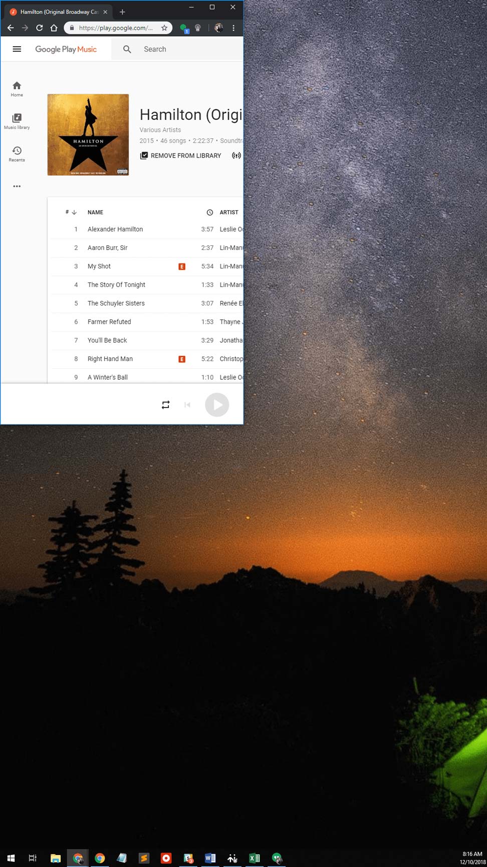
Google Music
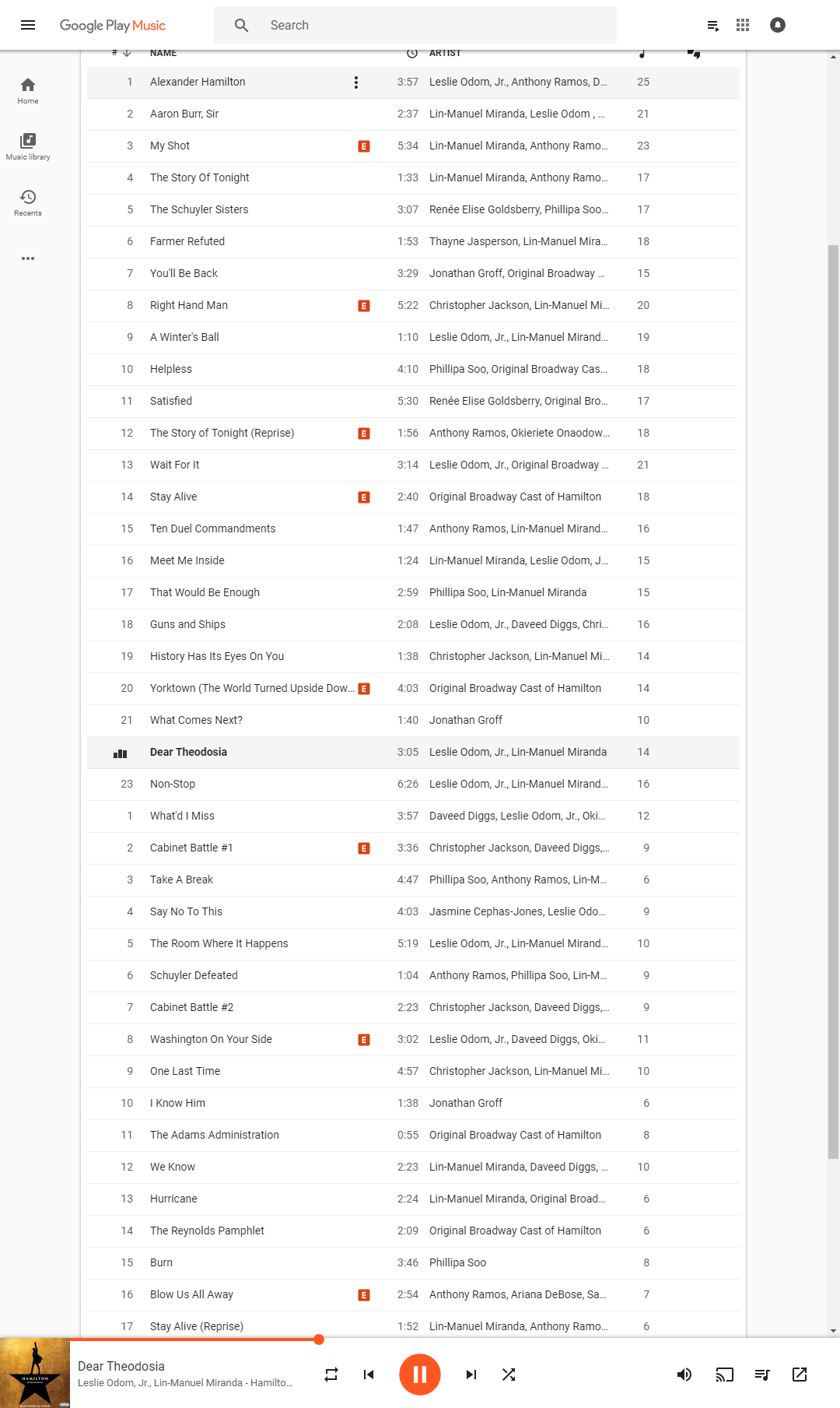
Google Play Music looked pretty good. All of a sudden I could see all the way to ends of albums I was selecting from. Not necessarily useful, but it does show a lot more future information.
YouTube
YouTube was nice, dropping the “Up Next” section below the video, banishing the Comments section off of the screen. Can’t say I have any complaints about avoiding those. Though of course, YouTube full screen on a horizontal monitor works better if you are only viewing the video, in general here I would use YouTube in combination with another application on the same monitor.

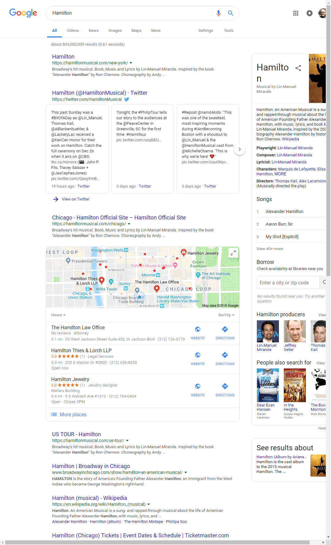
I was fairly surprised at a Google Search. You would think a list of search results would work well vertically, but even Search now has a sidebar, which did not fair well with the vertical treatment.
Atlassian Jira
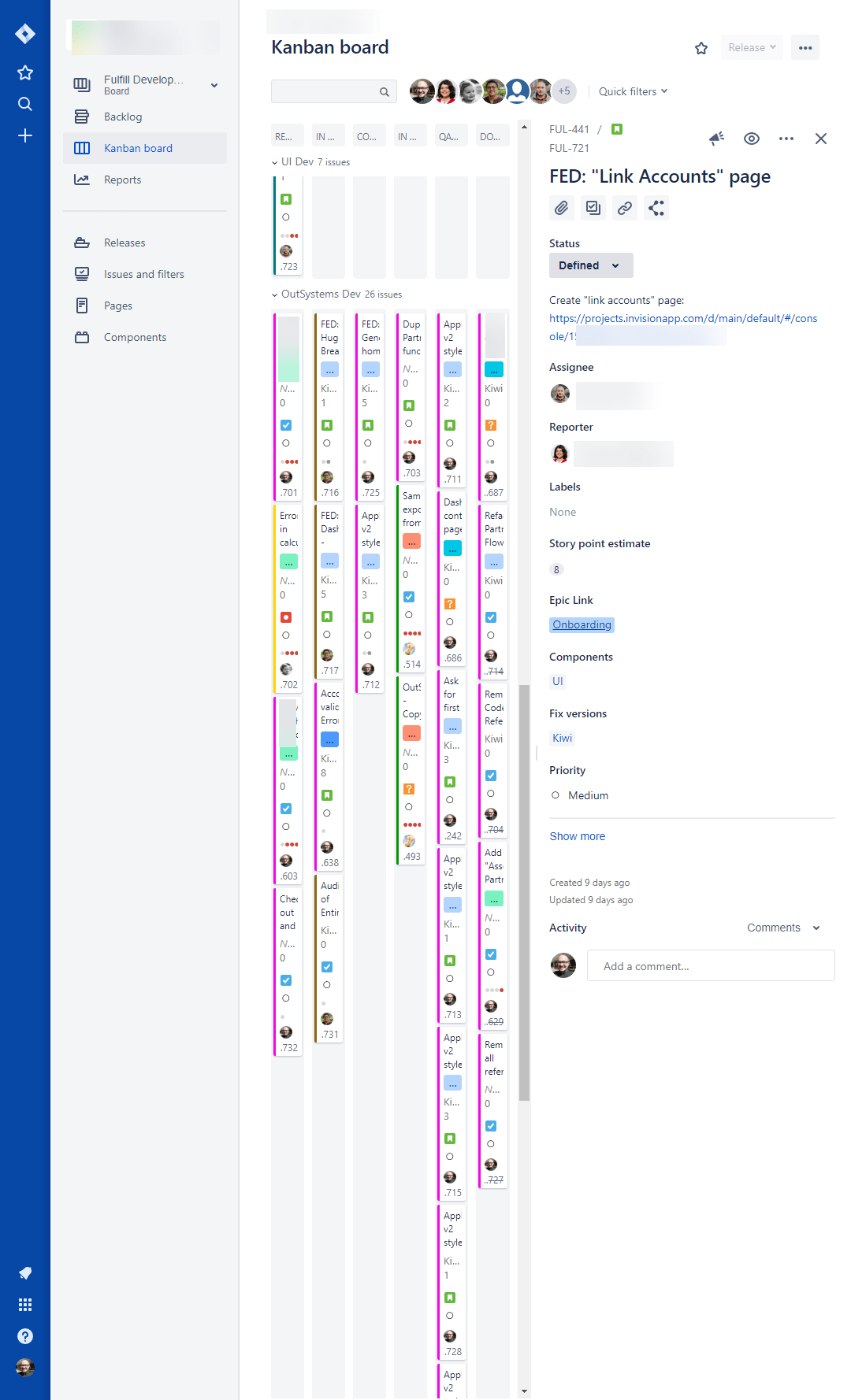
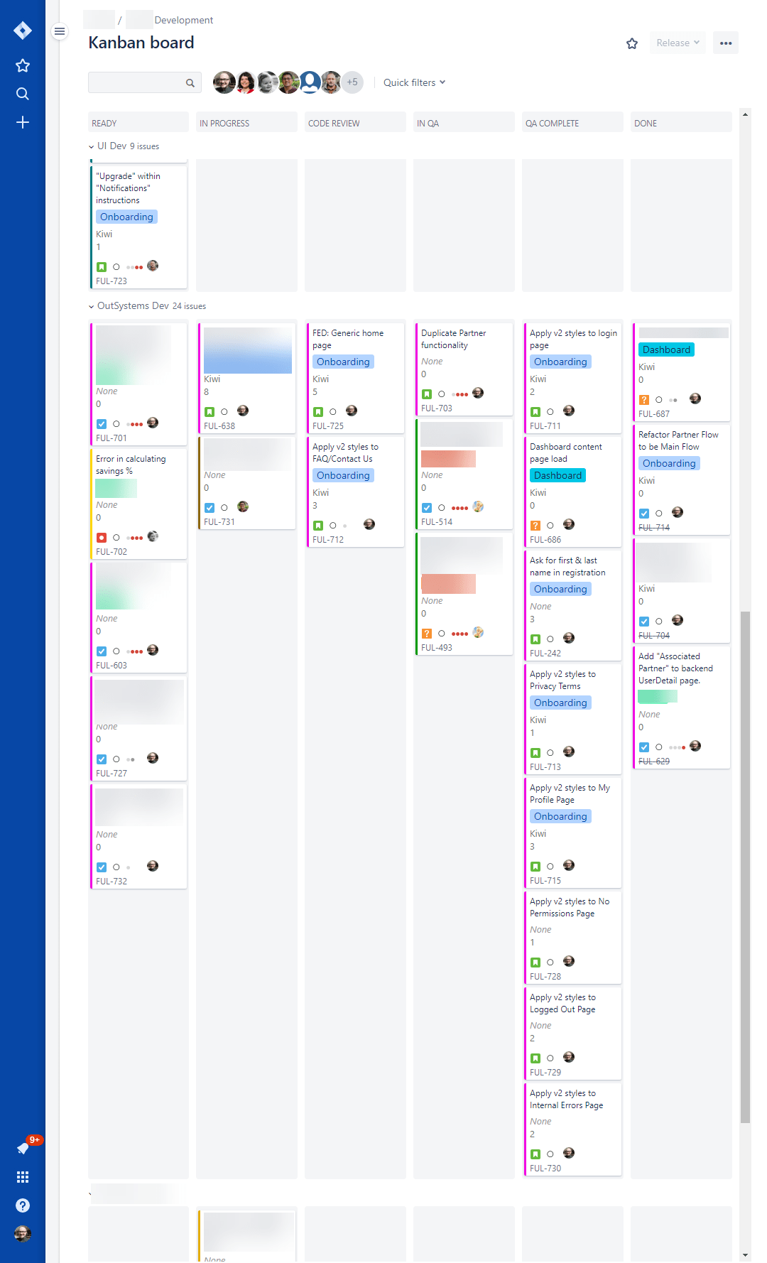
Next, I took a look at Jira, the software issue tracker we use in my office. At first glance, it looked pretty terrible. Suffering from dual sidebars Jira became unusable. However, once I closed the left sidebar and enabled the “New Jira issue view” which uses a popup modal instead of a sidebar, it suddenly became usable. The usefulness of this over a horizontal view is debatable, as really this would only help if you have far too many issues to focus on at the same time.
Medium
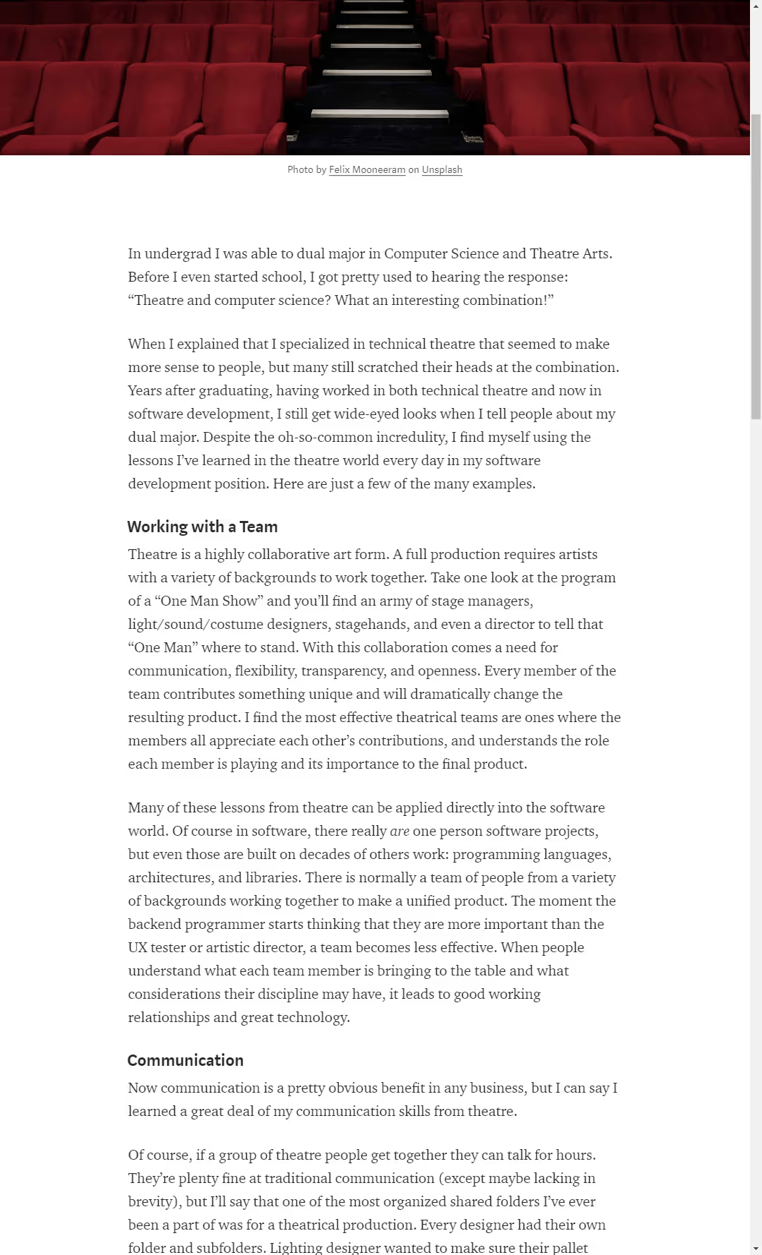
Medium looks fantastic, the true majesty of a vertical monitor. Read your article with minimal scrolling!
The Washington Post
Unfortunately, it looks like WaPo who does not follow Medium’s minimalism stuck a sidebar on the article, even at this size, causing the vertical article reading to lose some of its glory. After some quick Chrome Inspector tweaks, I got the article full width, but that is a little excessive for day-to-day use. (Hey did you guys know the Post uses Bootstrap?)

Slack
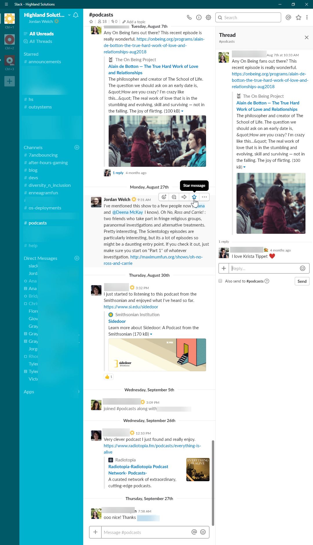
Slack was fairly straightforward. Not too bad of an experience, but with two Sidebars it squished all content, letting me see the long list of saved DMs while taking attention away from the channel’s content.
Code and Plain Text Files (Sublime)
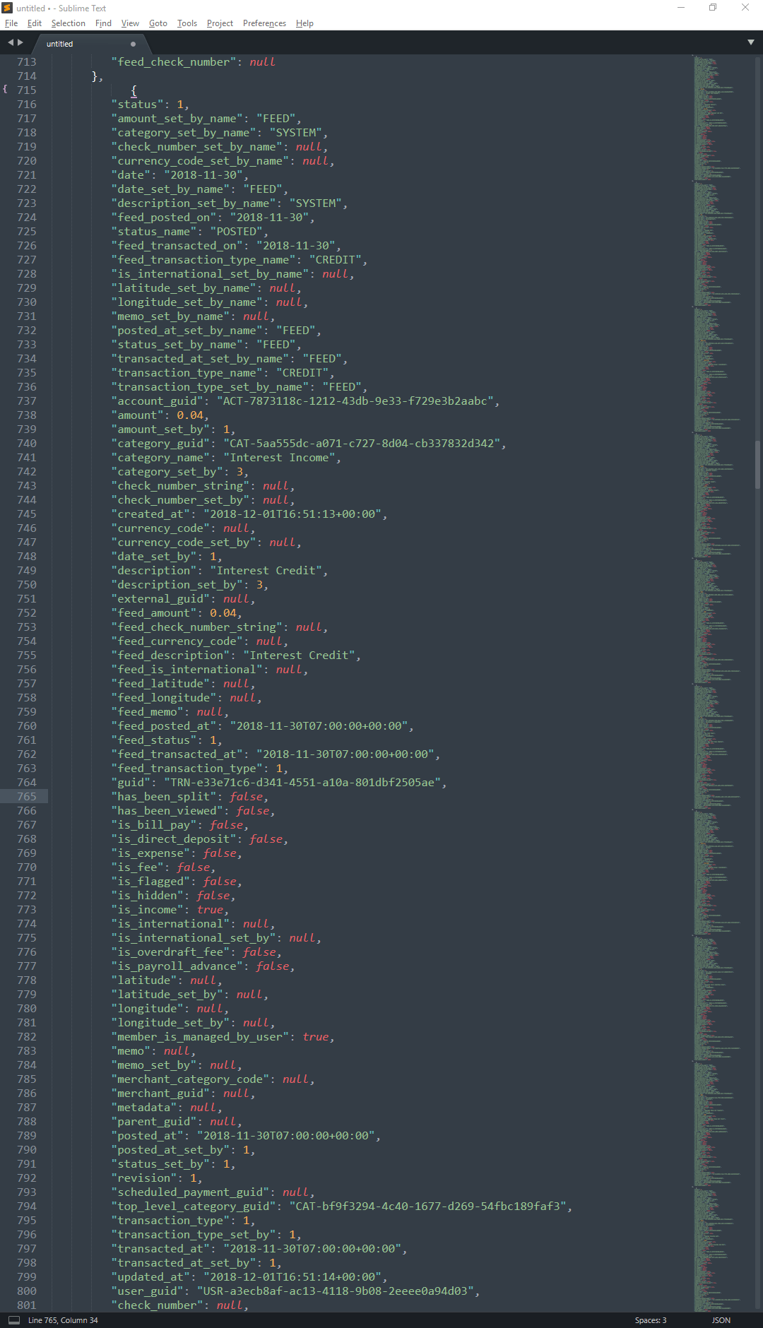
This is another section where a vertical monitor shines.
OutSystems IDE (Service Studio)
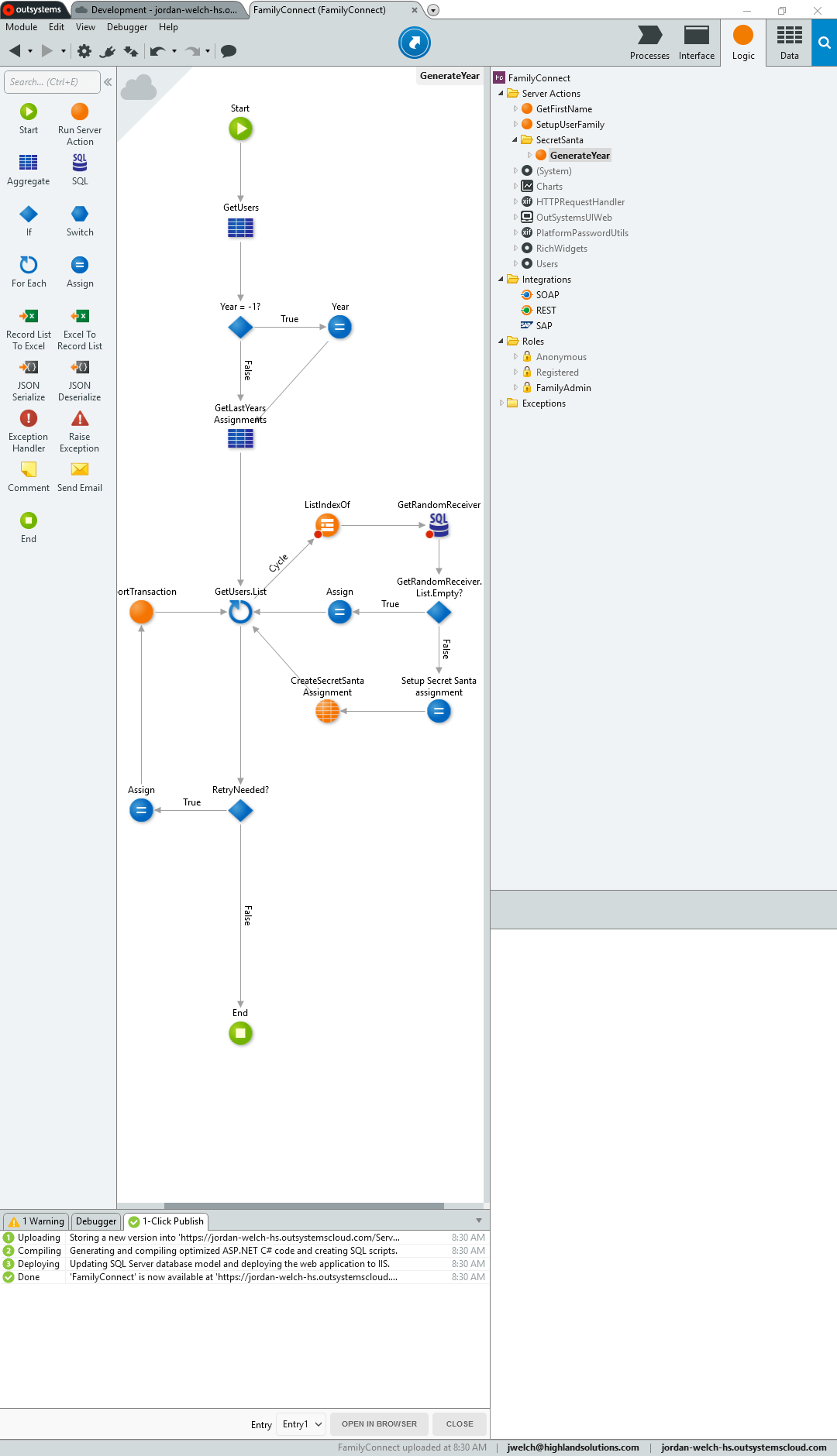
OutSystems is a low-code development environment that I do a lot of work with. Like many Integrated Development Environments, OutSystem’s Service Studio is designed with heavy emphasis on sidebars. This plus the heavily visual emphasis of OutSystems development definitely was harder to use.
In Conclusion
Worked Better
- Google Play Music
- Gmail
- Medium
- Text Editing (Sublime)
Neutral
- Jira
- >Slack
- YouTube
Didn’t work so well
- OutSystems Service Studio
- Washington Post
- Windows window snapping
I’ve found this a fairly interesting experiment, looking at an edge use case of software design and seeing how applications would fare.
In general, I found a lot of places where a vertical monitor caused me more problems than it was worth. Much of application design now revolves around sidebars. Once you get into a site with both a left and right sidebar, the vertical monitor begins to be a bigger hassle than benefit.
The sites and applications that really shined where all ones based on reading a lot of content at the same time. However, even here, the occasional sidebar caused vertical content to squish into a smaller width for the entire page, even if the sidebar only was at the top.
After this experience, I’ll continue to keep one monitor vertical, if only because I don’t have room for another horizontal. And from now on maybe I’ll add vertical monitors as a consideration to the designs I am working on.
