Highland turns 21 this year. It’s a milestone that not many companies get to celebrate. Only 50% of businesses survive their first five years. And just 7% make it to more than 20 years. We’re grateful to have crossed those decisive thresholds. And in doing so, we’ve become a company that’s almost unrecognizable from our early days.
We realized last year that the time had come to revisit our brand. We are delivering increasingly sophisticated designs and products for increasingly sophisticated clients, and our brand needed to grow in its sophistication, too.
Even more importantly, we realized we had developed some convictions about the kind of work we excel at and the work we’re most passionate about doing. Yet we hadn’t summoned the courage to make that explicit. Turning 21 seemed like the right time to decide what we wanted to be when we grew up!
We realized we had a few major changes we needed to make:
- First, our brand and messaging needed to more clearly communicate our convictions about our purpose, both as a company and in the work we do.
- Second, our brand didn’t convey the level of visual maturity necessary to validate our team’s capacity for delivering the kind of work our clients receive and expect from us. We had a serious case of being the cobbler’s kids who have no shoes.
- Third, our brand didn’t fully convey the kind of culture and personality we’ve fostered at Highland, a culture that has flourished in the last few years.
We knew we wanted our new brand to look mature and polished without being slick or trendy. Instead, we gravitated toward a warm, earthy ambiance that reflected our no-frills, people-first culture. We chose to partner with Drawn, a brand agency outside of Portland, Oregon, to bring our new brand to life, because their work and approach exemplified those characteristics.
Learn more about our process of deciding to rebrand and our brand journey in this video from Highland's President Jon Berbaum
Our brand is an external reflection of our company’s personality — our values, what we do, who we serve, our mission. Before we began any work on logos or colors, we put an abundance of thought into our Brand Personality Statement. You can read the whole thing here, but we’ve summarized the answers to some key questions below:
What is our mission? Our purpose is to make a measurable impact on human flourishing in the world. We believe that what we make and how we work should make it a little bit better to be alive: for us, our clients, and their customers.
What do we do? Highland is a digital product consultancy. We research, design, and build digital products and experiences.
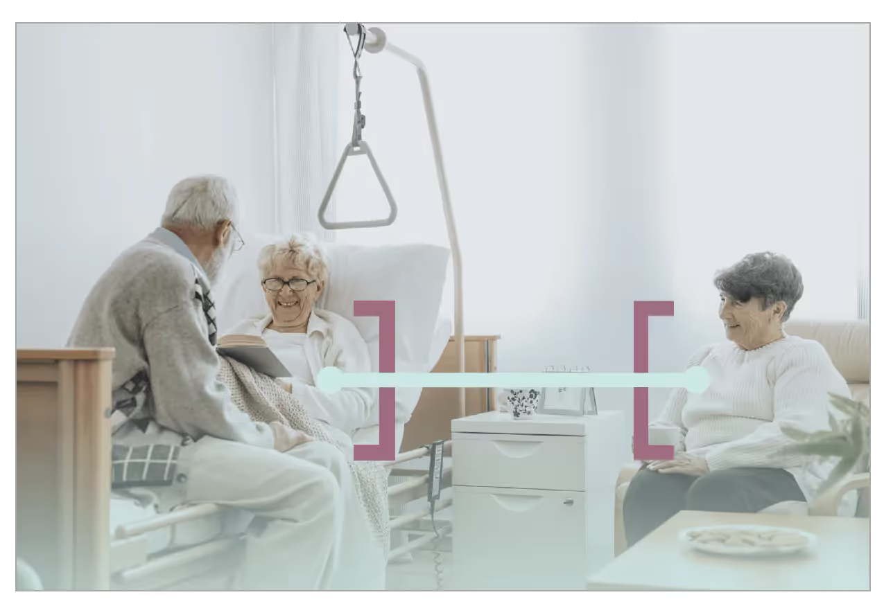
Who do we want to do it for? We work with leaders of services companies who are creating new digital products — such as professional services, healthcare, financial services, education, and non-profits— with a special focus on organizations focused on improving physical and mental health, establishing financial wellbeing, and cultivating community.
How do we do what we do? How we work isn’t magic: we create small, skilled, empowered teams that work hand-in-hand with our clients, guiding them through our proven processes and teaching along the way.
This metamorphosis is the culmination of a three-year journey that has been equally rewarding and challenging.
It has massively reshaped who we are, what we do, and who we work with. It has added new specializations to our team. It has shifted us emphatically from digital craftspeople executing someone else’s strategy, to strategic thinkers and designers co-creating and executing a strategy built on rigorous insights and participatory design.
It has also forced us to resist the trend toward specialization in design and digital, where strategic design firms don’t build what they imagine, and development firms don’t design what they build. We believe this specialization makes it easier to manage a design or development agency but harder to create real human-centered digital products that actually exist in the world. And so, we’ve committed to becoming and remaining one of the few agencies that can truly move new ideas from problem space to launch.
It has pushed us to grow as individuals and as a team. It has motivated us to take increasingly deeper levels of responsibility and ownership over the things we are putting out into the world, and the consequences — both positive and negative — of that work.
But it has been worth it. We believe in a vision of the world — and of its economies — that sees the flourishing of people as a central goal. We find ourselves collaborating with leaders in for-profit and non-profit organizations who share this vision: who seek to accomplish more than numerical growth, increased revenues, and shareholder returns, leaders compelled by a shared vision of a society and an economy where people flourish.
From “Highland Solutions” to “Highland”
After we established our Brand Personality, we took a close look at our name. While we explored changing our name completely, we learned through an internal design sprint that the name Highland still suited us well. But “Solutions” felt dated and too focused on our technical output instead of our strategic capabilities.

So, going forward, we are dropping the “Solutions” from our name and will refer to ourselves simply as Highland. Our domain name will remain highlandsolutions.com until we can convince the insurance company using highland.com to let us use it, or until we find another compelling domain that we think justifies a move.
Before I share more about the Highland brand of today, let’s take a step back and see how we’ve transformed over the past 21 years.
Here is the very first version of the Highland website, birthed at our founder’s dining room table. It’s the epitome of early 2000s internet style.
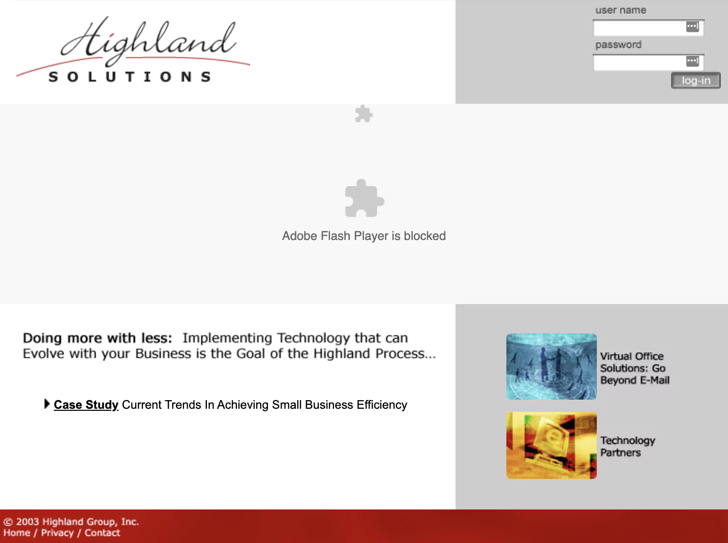
Let’s start with the logo. There appears to be a hill? I have no idea.
We most likely had an astounding value proposition, but it will remain forever a mystery since it has been lost in time with the demise of Flash Player.
If you look closely, our case study appears not to be a case study, our main offering might be something better than email, and our main technology partner appears to be Internet Explorer or maybe Microsoft overall.
If that was true, we remain deeply sorry.
The pre-teen years
Now, here’s the Highland site in 2012. We grew a lot in our first 13 years! Our initial focus on small, local businesses by providing tech support and basic websites had shifted to providing web application development to small and mid-sized businesses. Our sophistication was growing.
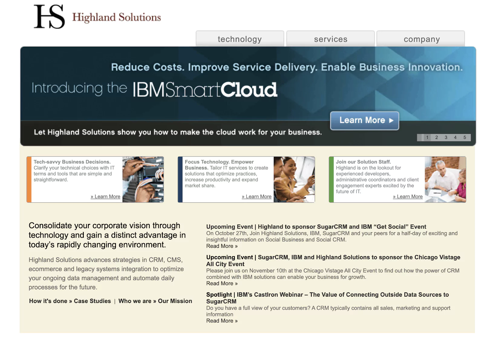
It’s obvious to me here that we’re in full, early adolescence, doing all kinds of things that — in hindsight — we are rightfully embarrassed by. This is 13-year-old Highland, being really awkward.
The logo had moved from the initial cursive flourish to a merger of a capital H and a capital S. Discerning viewers will note that our brand mark appears to be both an “HS” and an “IS” — a nod to Information Services, our general category. The bright red text had darkened into a more stately deep red. At the same time, you can see the color palette on the site wanting to shift brighter, bumping against the more restrictive red and black in the logo.
Since side-scrolling banners were all the rage around this time, we don’t get to see the other four most important things our home page had to say. Some of them were probably more on point than IBM Smart Cloud, since we’re still in business today.
All that being said, I was here in 2012! I liked this website! It was a big step forward!
A more colorful Highland, with new capabilities
In 2015, our now-Director of Product Design, Jeff Blanchard, killed off the black and red Highland brand that had existed since 1999, giving us a more colorful, personable brand with a thoughtful backstory.
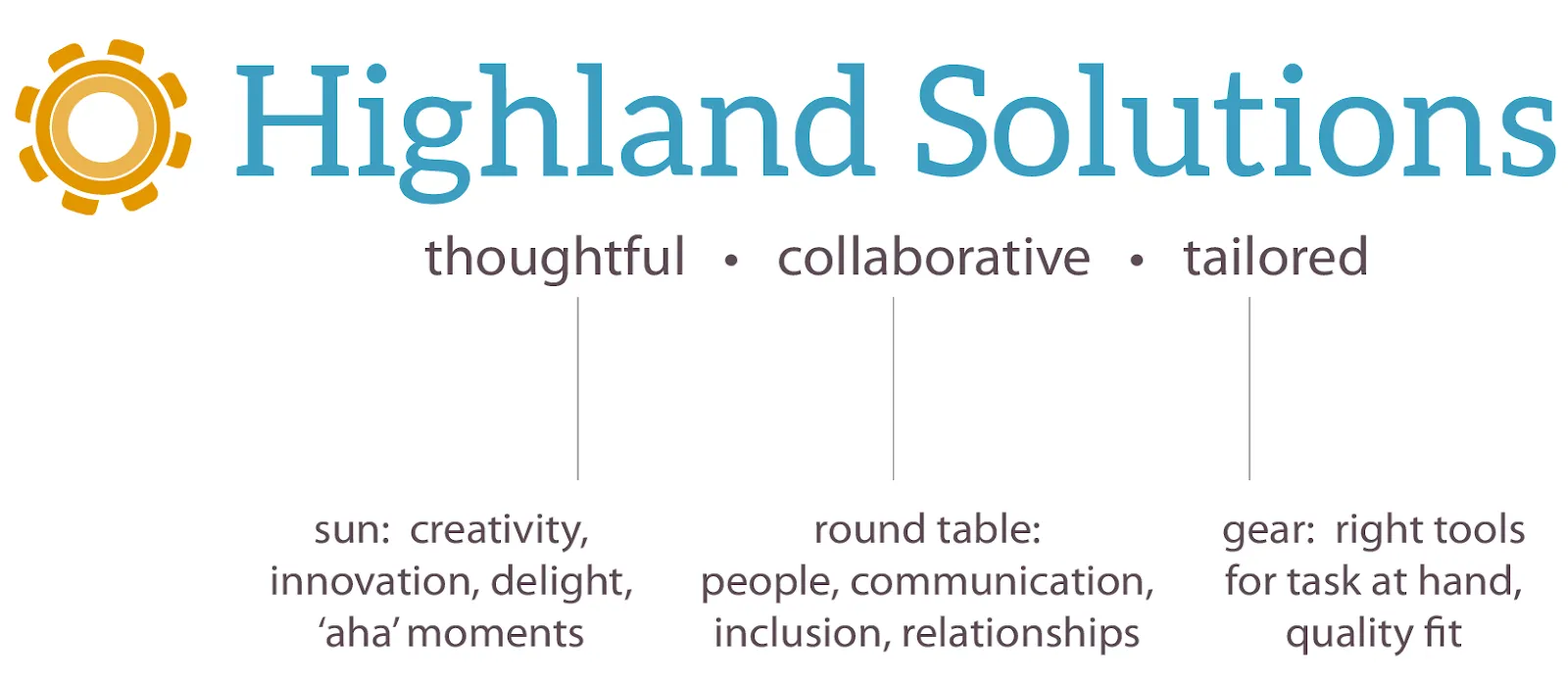
This brand served us well over the last five years. It leads with a bright blue, which I initially loved. However, this color became the color du jour for virtually all technology and software companies between 2014 and 2018. It’s like naming your kid Liam in 2012 right before it became the most popular boy's name in the country for the next five years. sigh
Still, a bright, classy brand was welcome. The brand mark is new, leaving behind the mashed-up H and S, for a multi-layered icon that can be interpreted as a sun, a round table, and a gear. (I don’t think anyone ever saw it as a table, but the sun and gear worked.)
This brand took us into the CX era of Highland — an up-the-value-chain strategy to engage with customers who weren’t shopping around a technical spec for a web app. Here’s how we communicated our CX value prop on the Highland website a few years later:
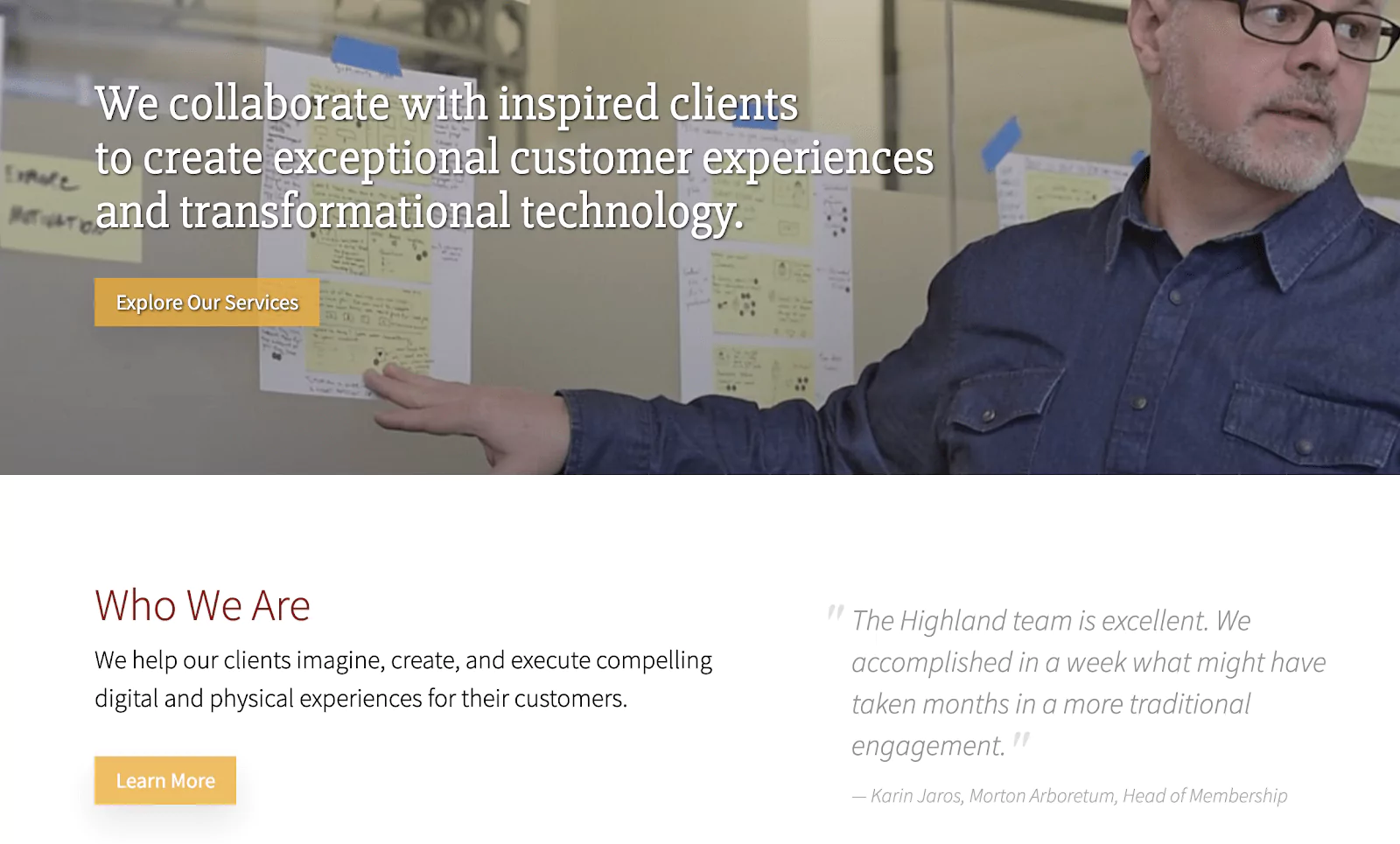
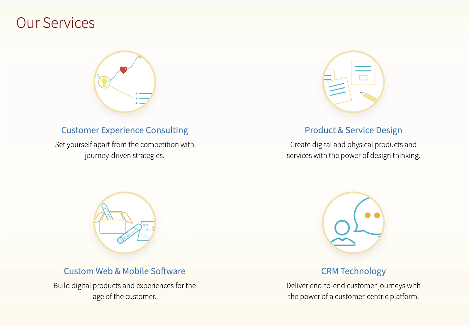
Yellows, blues, and reds abound! And our unofficial mascot, David Whited, the Director of our CX Practice, was doing a lot of work for us. We specialized in photographs of people in front of assorted sticky-filled backgrounds, either smiling happily or looking deep in profound thought.
Our first attempts at a more holistic value proposition began happening here. I still think it’s not bad as a first shot. But as we explored the customer experience world, we found that the work we did actually fit more accurately into a larger category — digital experience — which better articulated our focus on using customer insights to create digital products and experiences.
Which leads us to today — our new Highland brand.
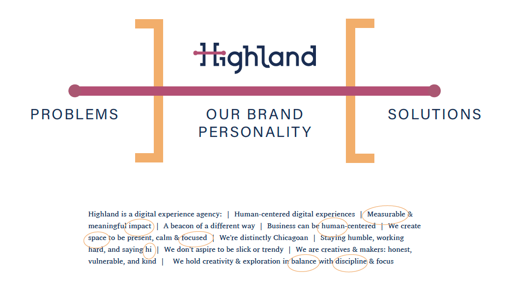
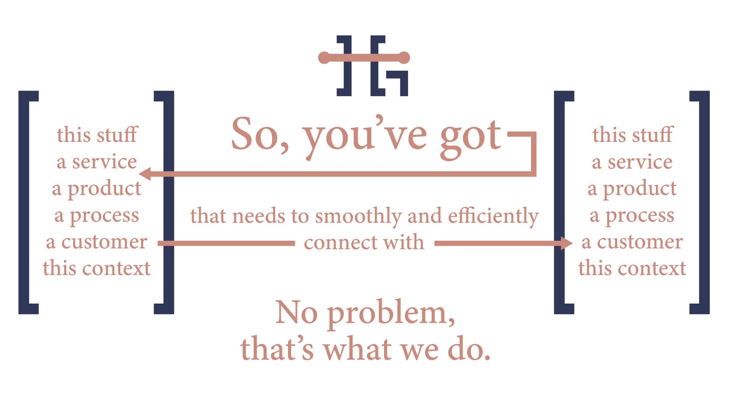
The Brand Personality Statement played a critical role in the creation of every element of our brand. One of the smallest details of our brand personality — our Midwest nice demeanor, which we described as “working hard, staying humble, and saying hi” — became our new logo mark:
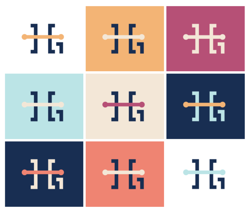
The logo itself reflects how our work has matured over the years, providing increasingly complex solutions to seemingly intractable, human-centered problems.
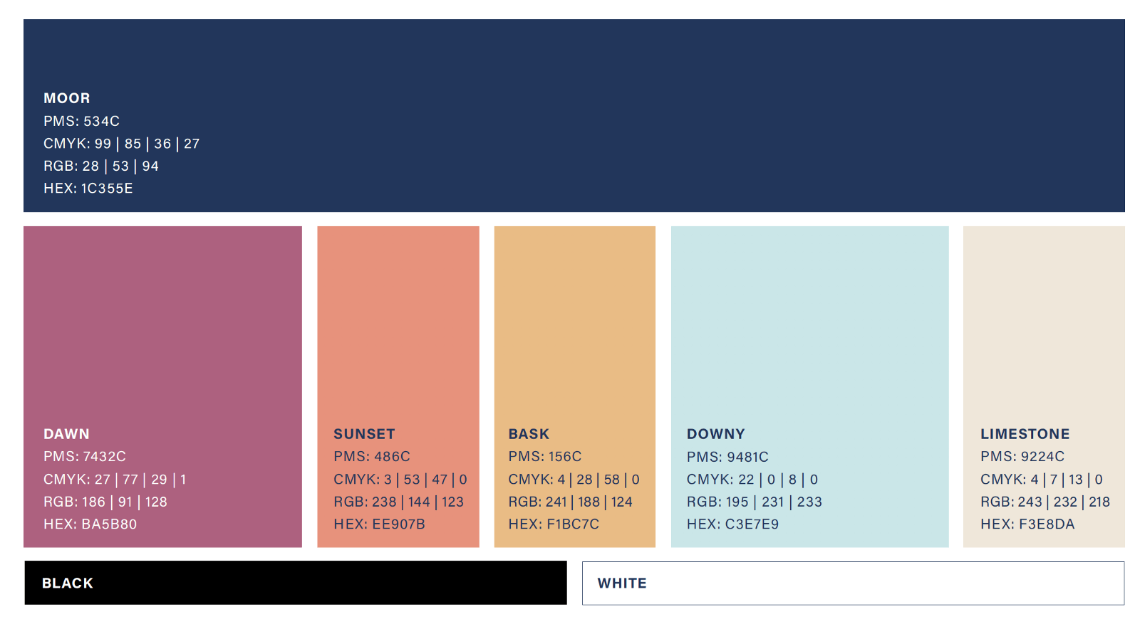
We also landed on a new color palette. This palette nods to some of the blues and yellows of the former Highland brand but incorporates more warmth and variety to bring forth the organic and human nature of our culture and our work.
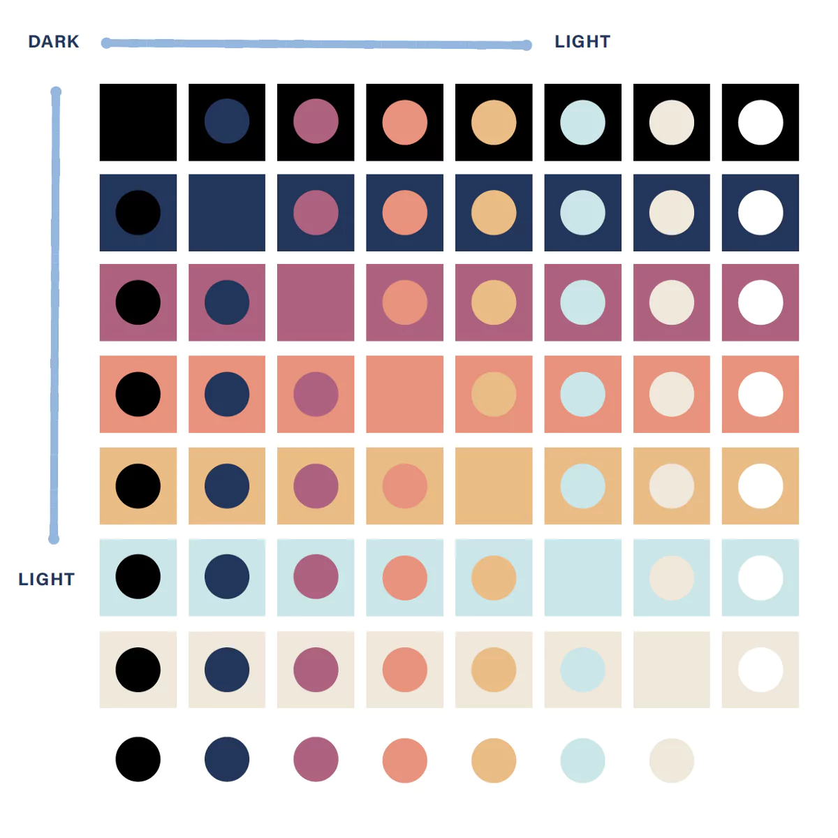
We prioritized digital accessibility throughout the rebrand, emphasizing color combinations with sufficient contrast so that content on our website remains visible for those with vision impairments.
One of the most unique aspects of our new brand is the Highland Slab, our custom typeface, which you can see in our logo and our logo mark.
The Highland Slab draws on several influences that shape who Highland is today. Many Highlanders have nontraditional tech backgrounds and hail from the humanities — we’ve got pastors, philosophers, psychologists, and even an opera singer among our ranks. The Minion Variable script and its roots in book publishing felt like a great way to pay homage to the way that the arts and humanities shape Highland’s team and culture. It’s balanced by the IBM Plex Mono font, which is easily recognized as a popular font for computer code.

Put these two together (and make a bunch of tweaks) and you’ve got the Highland Slab:


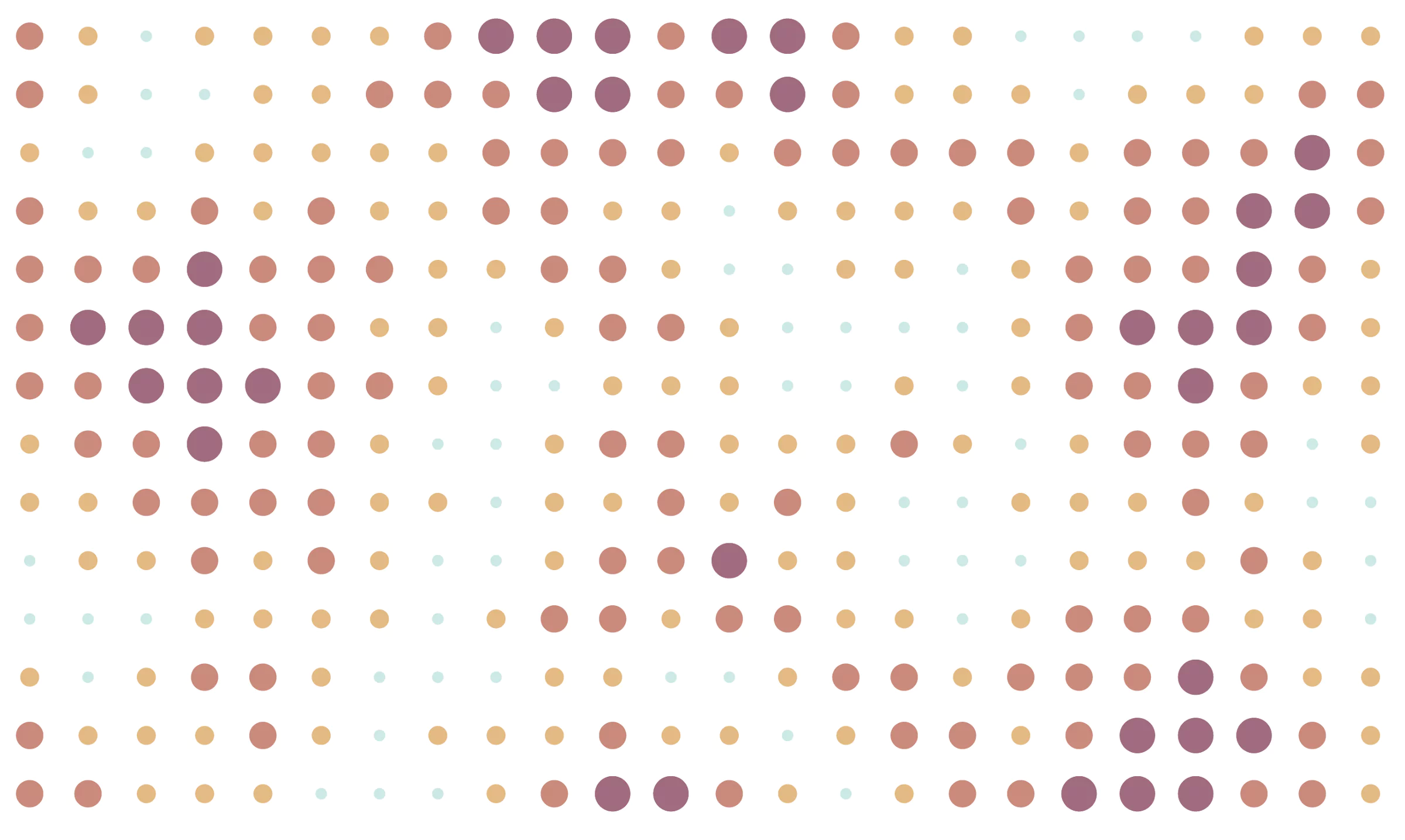
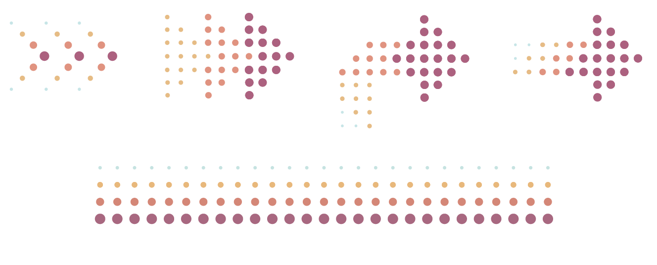
Another exciting element of our brand is the visual patterns inspired by the way that we connect the dots for our clients.
Highland is a group of problem solvers — identifying problems and designing solutions. There is a connection between problems and their identified solutions that can be visually communicated with various dot patterns — connecting lines between dots and utilizing the movement of dots.
And of course, no rebrand is complete without new company swag. We got new t-shirts that show off our Highland values and also ordered some Highland-branded shot glasses to celebrate the launch of our new brand and ring our 21st birthday in right.
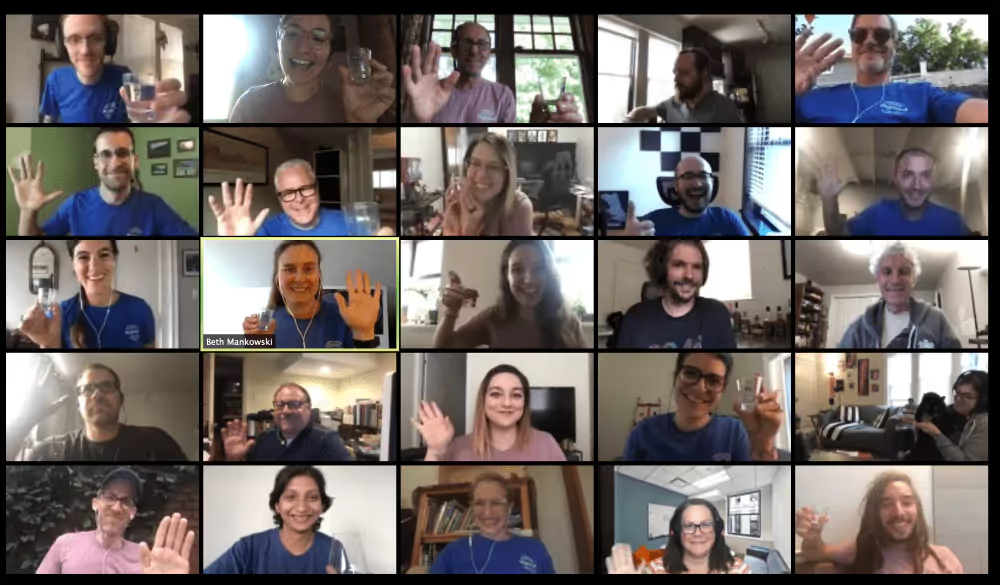
Highland has been in an extremely high state of change and experimentation for the last three years in particular, and that isn’t going to stop anytime soon. The struggle of these few pandemic-filled months aside, we’re on an incredible trajectory.
We’re excited to be sharing our new brand with our clients and our community. We’ve been growing and transforming for decades, and now we are finally able to translate that maturity and sophistication in an external way.
We’re committed to Highland being a place for human flourishing in our corner of the world, and keeping it that way for decades to come.
Our difference? Our team. Take a look at what Highlanders have been up to while we've been working remotely this year.
