By popular demand, I am writing about all the extreme measures I’ve taken to make iOS as spartan and minimalist as possible. If you’ve read my other posts in this series (macOS, Your ~/.ssh/config, Your ~/.bash_profile) you’ll know that I try to take these things to the limit.
My proclivities in iOS are not all that different from macOS: kill the notifications, no decoration, keep things “flat.” But there is one shocking difference: all grayscale! Yes indeed, dear reader. My phone is void of all joy, distraction, and color! There is a fledgling movement of folks doing this on their phones to introduce some friction and hopefully help cut back their usage. It doesn’t work for everyone, but it works for me. Since turning on Grayscale I use my phone about 30% less.
Let’s start with that because it is the most radical, then work through the other settings.
Grayscale

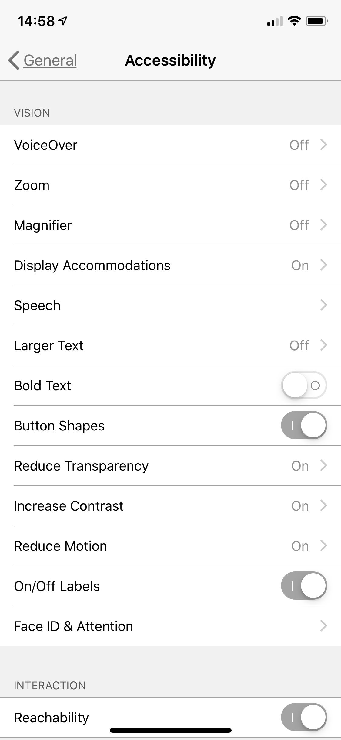
Enabling the Grayscale color filter on your phone introduces friction and makes it slightly harder to use. You can find this under Settings > Accessibility > Display Accommodations.
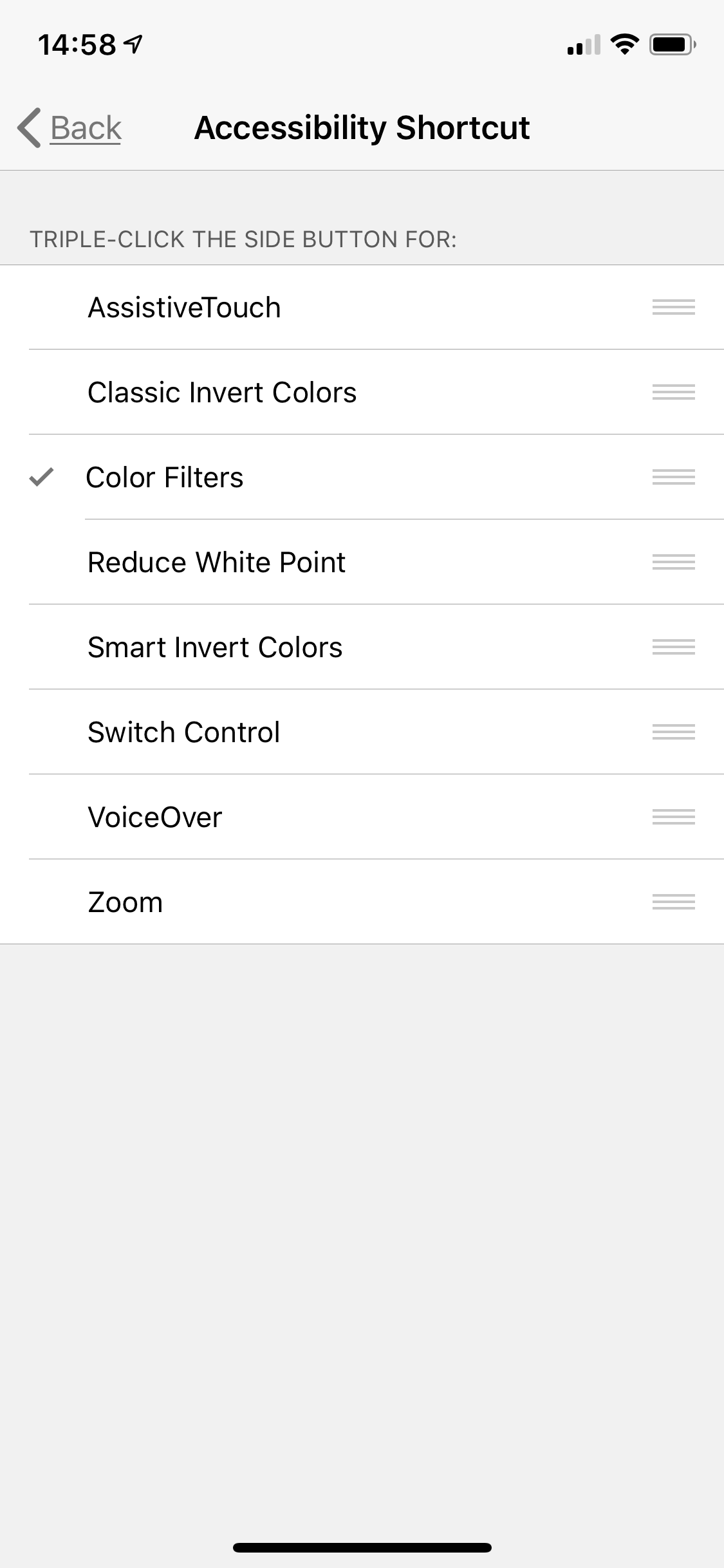
Always having my phone in black and white reminds me not to spend a lot of time on it. Just complete my task and then put the phone back in my pocket. The key to making this switch work, however, is enabling the Accessibility Shortcut to quickly toggle the color back on. Sometimes you just gotta watch a video or look a photo in full color.
Set this under Settings > Accessibility > Accessibility Shortcut. Now, with the Accessibility Shortcut set to Color Filters, I can triple-click the side button to toggle color on or off.
I’ve also figured out several other accessibly features including but not limited to:
- Button Shapes: On
- Reduce Transparency: On
- Increase Contrast: On
- Reduce Motion: On
- On/Off Labels: On
- Reachability: On
- Shake to Undo: On
“Button Shapes” are key because they add non-color-based indicators on interactive buttons or underlines on interactive text. “On/Off Labels” are similarly critical.
Let’s move on to the other areas of the phone.
Home
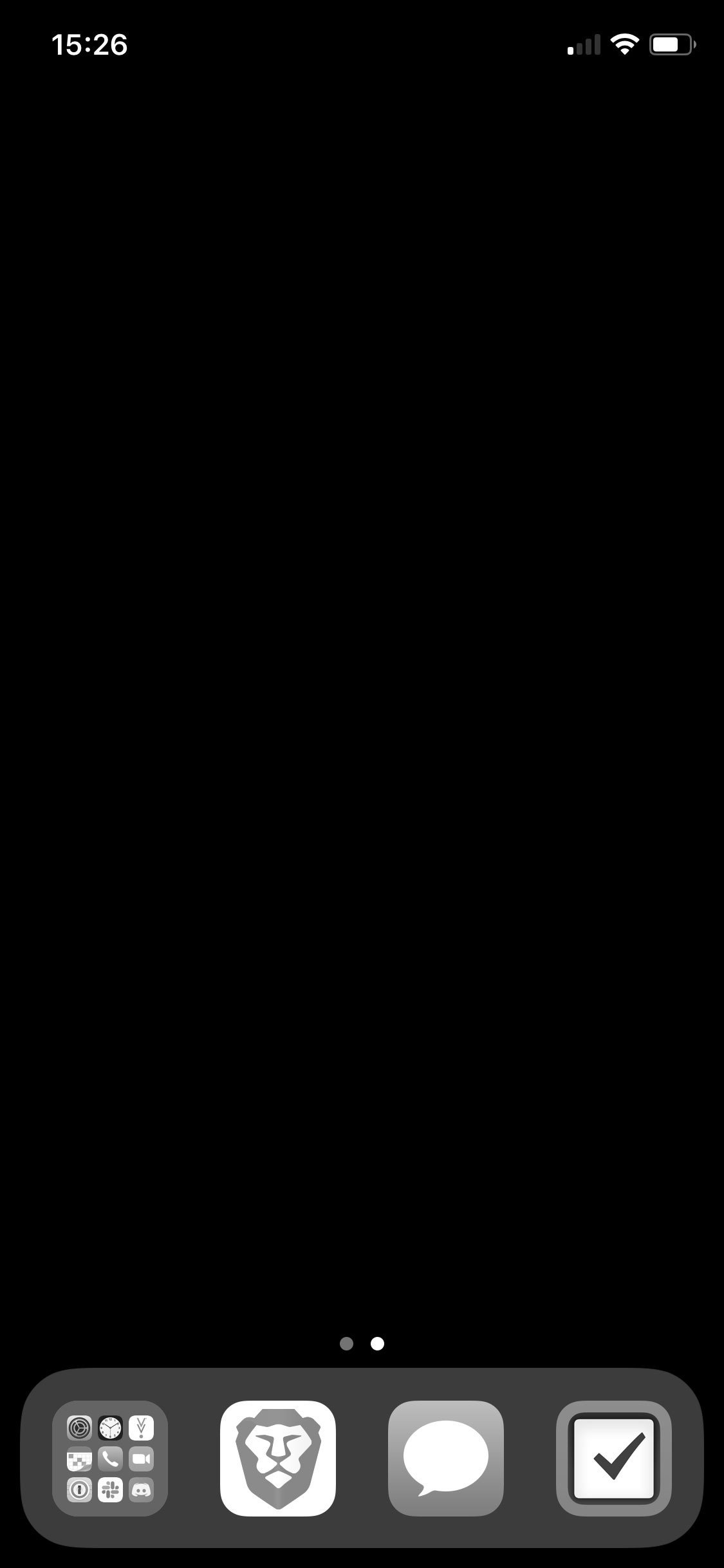
Ahhh, home sweet home. Stock black wallpaper. My three most commonly used apps (Brave, Messages, and Things) are readily accessible. And the rest of my apps are in a single folder.
Things is the central nervous system of my digital existence. I recently adopted David Allen’s Getting Things Done and it has changed my life. I cannot recommend it enough. Things, the app, is roughly based off of his framework. And this blog post inspired my “digital nomad” version.
Essentially, anything that requires more than 2 minutes to do gets added to Things and is processed later. Anything that requires less than 2 minutes is executed immediately.
A Single Folder
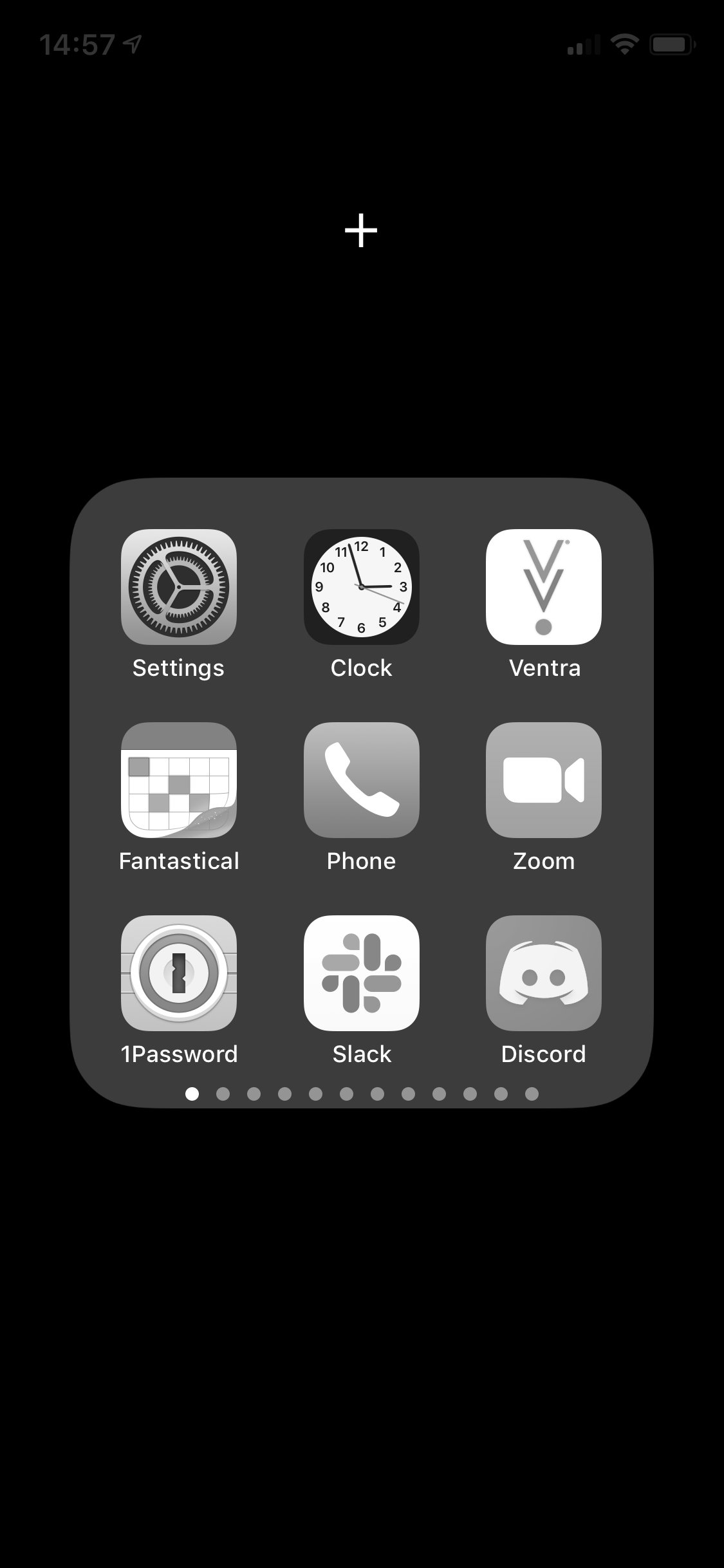
I’ve smashed all apps into a single folder and added that folder to the dock. A tricky thing about this is you cannot add apps to a folder when it is on the dock. You actually have to drag (or create) the folder to your desktop, add any new apps you just downloaded there, then drag it back. I rarely download new apps, so this doesn’t inconvenience me.
I also make sure to regularly delete apps I no longer use.
Apps are roughly sorted by descending frequency of use. But I rarely launch apps from beyond pages 1 and 2 of this folder. Instead, I launch almost everything with the Search feature.
Search
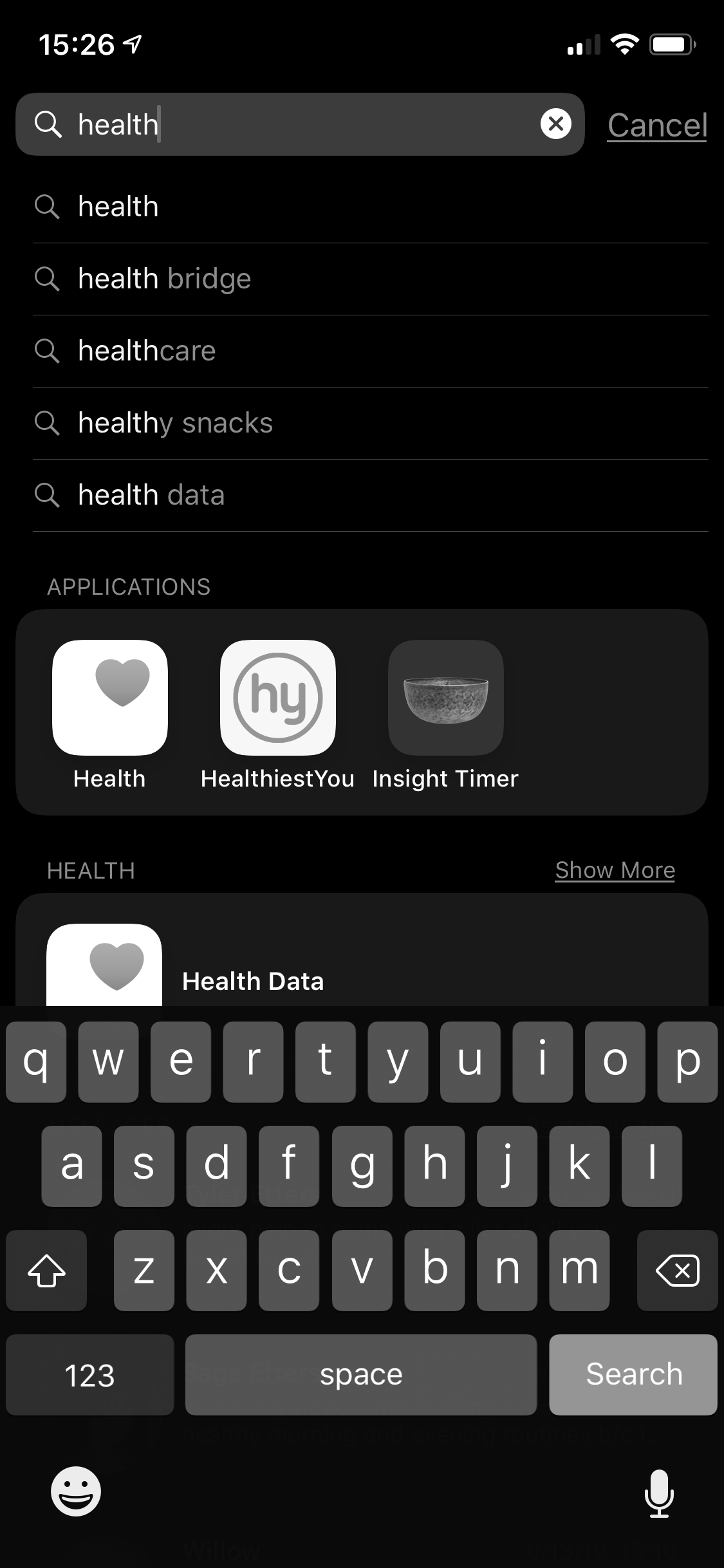
Since all my apps are in a single folder, I use the “Search” feature to launch basically everything. Just swipe down from the middle of your home screen and start typing the name of the app you’re looking for.
Notification Center
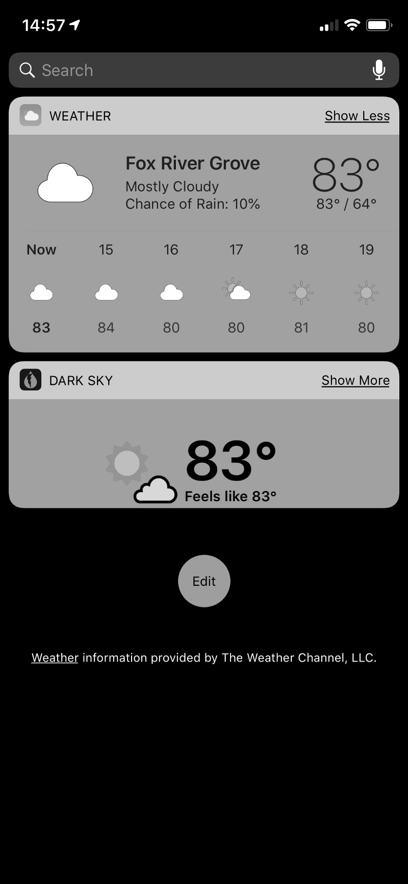
In the notification center I just have the stock weather app plus Dark Sky. I use Dark Sky for the precipitation maps and it is convenient to launch here. The rest of the notifications are turned off.
Notifications
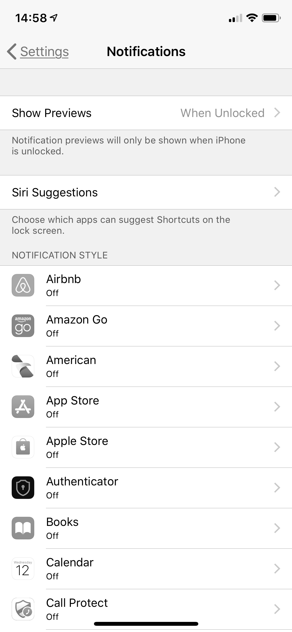
All the notifications are off except for the badge icon on Messages, Phone, Signal, and maybe one or two other time-sensitive services such as Lyft and GrubHub.
Text Replacement
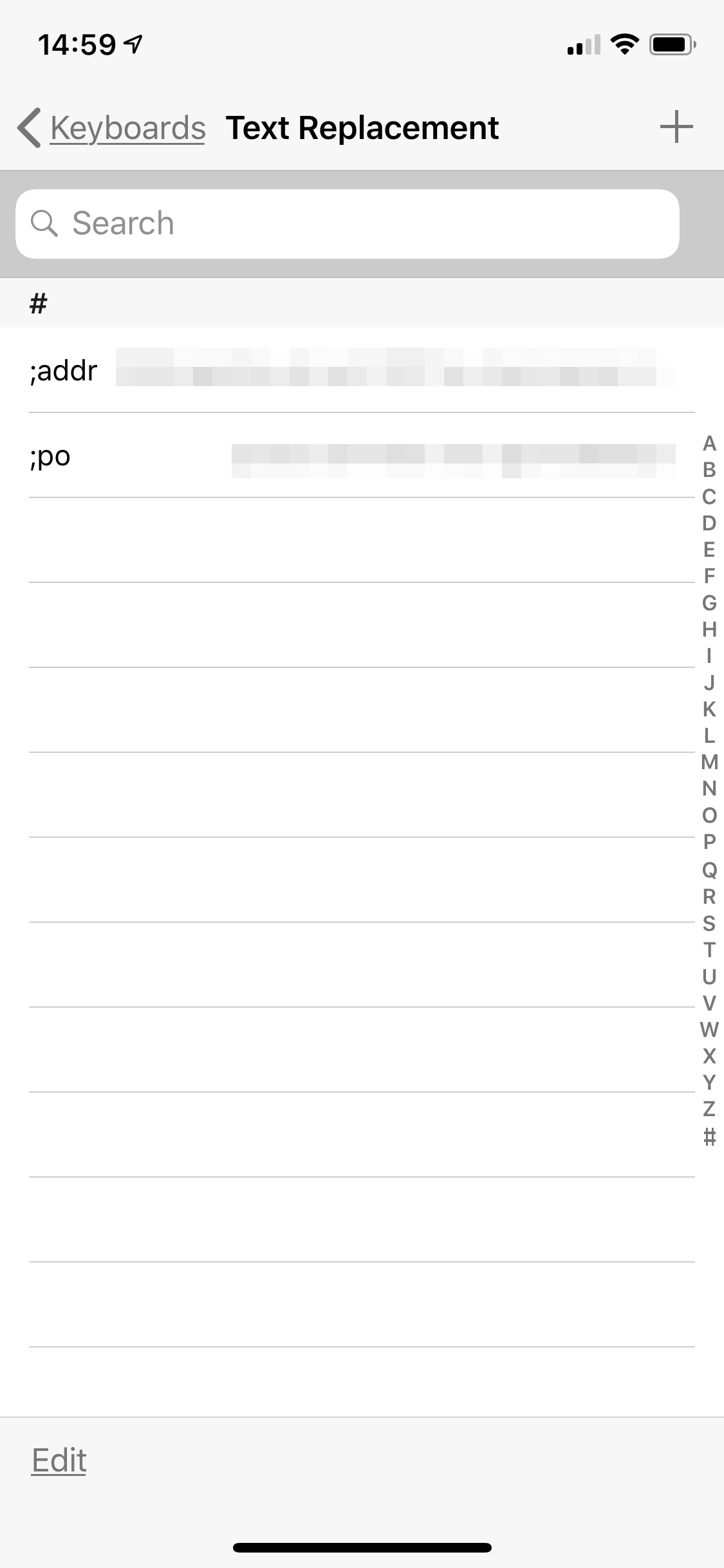
Text replacement allows you to type a few characters and expand it to a much larger collection of characters. If I type ;addr or ;po anywhere on my phone it will expand to my full street and PO box addresses respectively.
Alarm
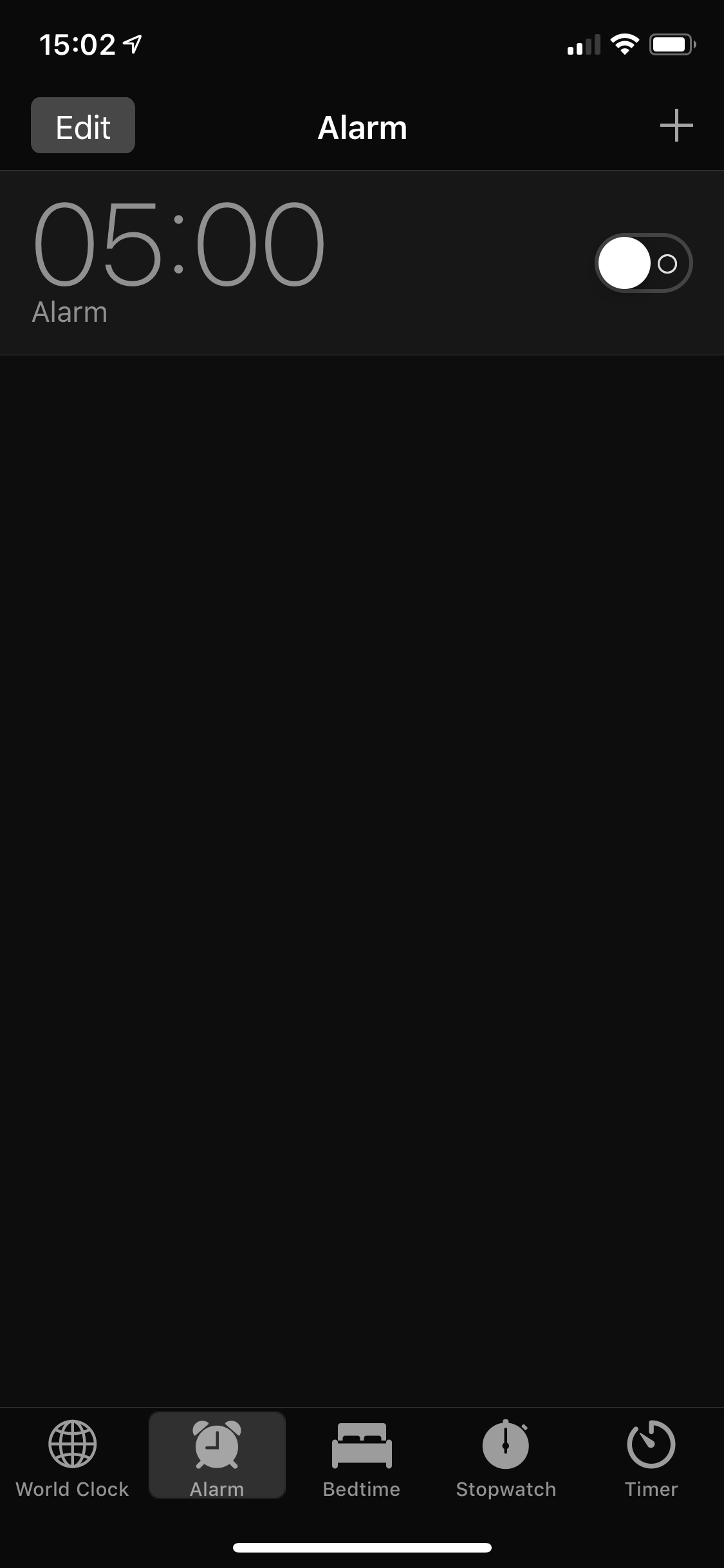
Your alarm clock is a contract with yourself. Set one and commit to waking up at that time. I try to get 7-8 hours of sleep each night and usually get up at 5. If I’m out really late I’ll just adjust this one alarm.
Other Peace of Mind Odds & Ends
- I have nightly iCloud backups enabled.
- I have a monthly repeating To-Do in Things to backup my phone to my computer.
- I have another monthly repeating To-Do in Things to backup my computer to an external drive (that is then put in a fire-resistant safe.)
- I have iCloud Photos enabled.
- I use Dropbox for file sharing between my devices.
- I use 1Password for password management.
With these settings in place, I can drop my phone in the Chicago River and not miss a beat.
My journey to this state has been many years in the making. Since adopting these practices, I feel like I finally have a healthy and mutually respecting relationship with my phone. Turning the color off on my phone makes me more aware of it and more conscious while using it. I count myself as privileged to even have a phone, and extremely privileged to have the space and time to write a blog post like this. I hope these practices offer you mental peace, help cut down the noise, and allow you to appreciate your possessions more.

