Honestly, I can’t keep up with all the nomenclature surrounding design, and that’s my job. It seems as though the definition of these terms is based on whomever you are asking that day. This has lead to confusion for me in meetings when there is no mutually agreed-upon set of definitions for these terms. In a world of gray, I’m trying to bring some black and white to this conversation.
Before I go down the rabbit hole regarding my own experience and opinions on design systems, let’s define a few terms. I’m pulling these loosely from the book “Design Systems” by Alla Kholmatova because I think this book does the best job of nailing down the vague. Also, if you’re reading this article, go read the damn book — it’s great.
Design System
Currently, there is no standard definition of what these two ambiguous words mean when put together. Super awesome. But let’s not despair. This term is often talked about in conjunction with pattern libraries or style guides. For designers, that should be familiar territory. I hope.
For the purpose of this article, I am defining a design system as connected patterns and shared practices organized to serve the purposes of a product. There are terms that are included under design systems such as design patterns, so let’s break that down below.
Pattern or Design Pattern
This is any repeating, reusable part of an interface that can be reapplied and repurposed to solve a specific design problem, meet a user need, or evoke an emotion. These can be broken down into a little more specificity. I like to think of the two kinds of patterns below as being on opposite ends of a spectrum, in that there will always be some level of overlap.
Functional Patterns These are the tangible building blocks of any interface such as buttons, menus, forms, etc. Think of these as cogs in a machine that come together to perform a specific function. Functional patterns imply that they exist independent of perceptual patterns, which they don’t. These functional elements can be styled in endless ways to form perceptual patterns. They are the skeleton and muscles of the design.
Perceptual Patterns This concept was a little more difficult for me to wrap my mind around at first. Perceptual patterns are the functional patterns with style. The style of the element should create an aesthetic and strengthen an emotional connection with the product for the user. Perceptual in this context means to evoke an emotional response. Functional patterns underlie perceptual patterns. They work together.
While both of the above examples are buttons, one is more simple in its style while the other implies a branded color and voice. If functional patterns are the skeleton and muscle, perceptual patterns are the skin. Sounds morbid, but skin is usually nicer to look at. However, one could argue that they both have personalities and thus perceptual patterns. And they do. Which is why I must reiterate that perceptual patterns and functional patterns can only work together.
Pattern Language/Design Language
Design language is another pair of vague words that mean little to nothing without context. Within a design system, there is a set of interconnected, shareable design patterns that form the language of the product’s interface. This combines functional and perceptual patterns as well as the context with which they will be used (mobile, desktop, etc). Simply put, these are the words used to talk about your product. They may be specific to that product. Just like “design language” can have a vast array of meaning, it’s important that the context is established surrounding a product to best ensure comprehension. This may take the form of a glossary of terms teams can referred back to in moments of confusion.
Pattern Library
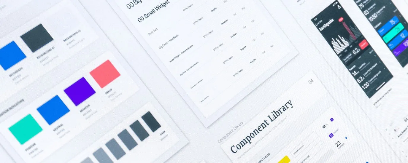
A pattern library is a tool used to capture, collect, and share design patterns and guidelines for their usage. This would be a Sketch component library or front-end development library, for example. I like to think of pattern libraries as my toolbox. Within my toolbox is a set of tools (components within a Sketch library etc) that allow me to create various solutions for various needs.
There are a lot of great initiatives out there looking to corral the endless tools we use to build digital experiences into libraries. One I am currently exploring is Zeroheight. Their goal is to unify design files and code in the same place, essentially creating a source of ultimate truth that can be referred back to while building a product. In my dream of dreams, this document would be built in parallel with the building of a product.
It’s important to note that pattern libraries have no absolute, definitive form. It’s up to the team and/or product how the pattern library is organized and established. There is no right or wrong way to do this.
Style Guide
A style guide is traditionally understood as a document that focuses on styles such as iconography, colors, typography, etc. Historically these have been linked to brand style guides that help reinforce a consistent tone to the voice of a company. These would be used internally and externally to help maintain a consistent representation of a brand’s identity. A simple example is Coca-Cola red. Their brand style guide ensures that the correct red is used in each application of the design whether it’s online or on a can. It is a set of rules to govern usage.
Design Practice
The art of using all of the above in real life. Seriously. It’s all of the moving pieces and your own personal process come to life. There is no right or wrong way to do this. Do your best to stay open-minded to the process and experimentation that comes with establishing and using a design system.
Now that we’ve defined these terms, they probably seem pretty familiar. As a designer, you should already be using some combination of the above — consciously or not. (If you are consciously not using any of the above, please e-mail me, I’d love to get coffee and pick your brain.)
If any of the above gives you a little bit of anxiety, fear not. Rules are sometimes seen as the antithesis of creativity. However, I believe a well-defined design system can help facilitate creativity and reduce overall project anxiety. That’s a whole other blog post, so check back soon.


